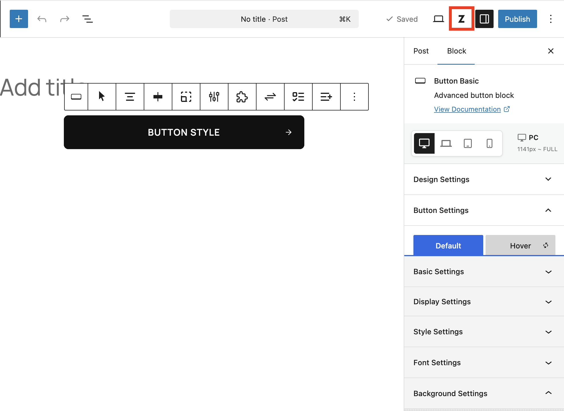
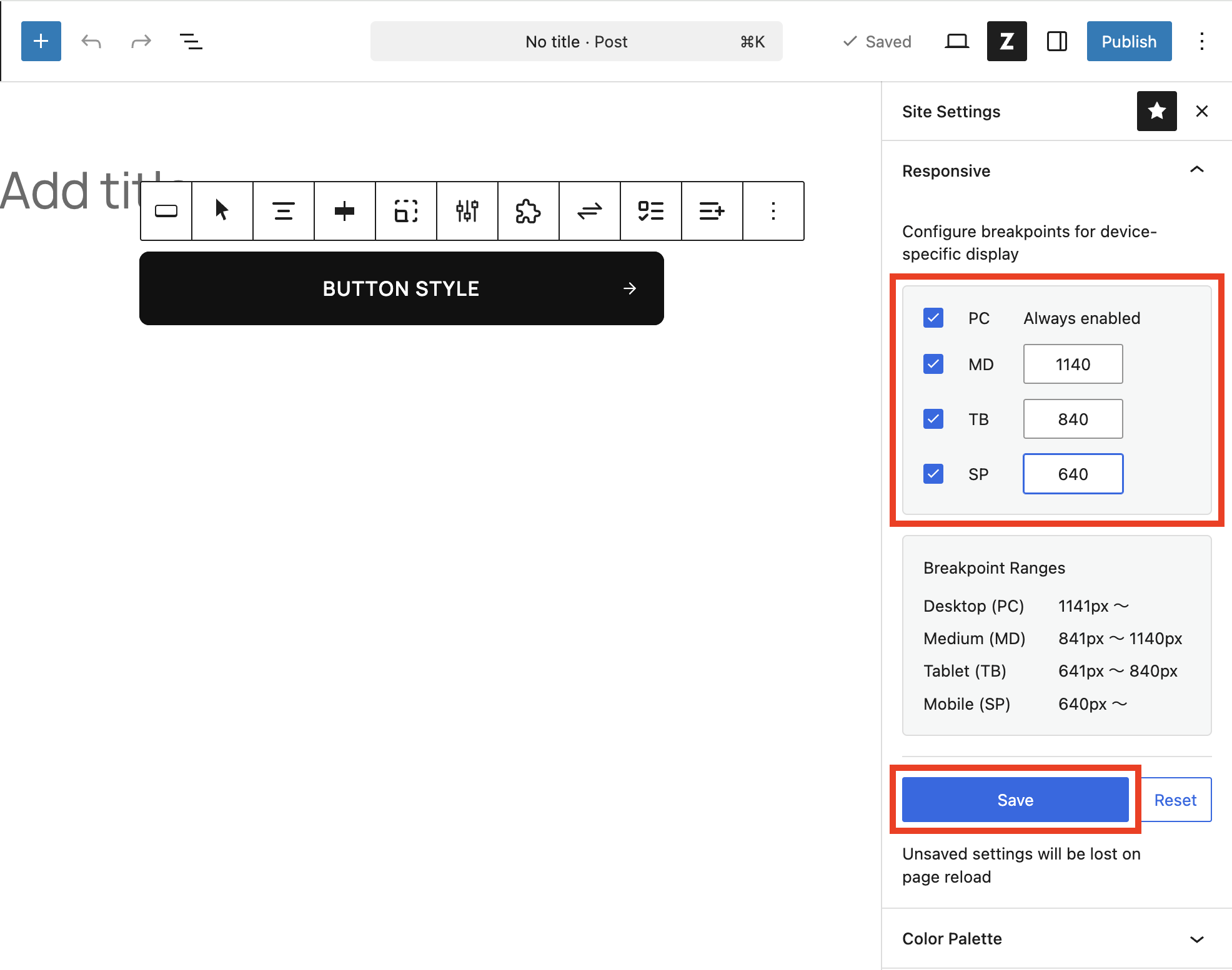
ZenBlocks manages the reference widths used for per-block responsive display under Site Settings > Responsive. This is not a standard WordPress settings screen — it is a site-wide configuration panel located in the ZenBlocks side panel within the block editor.
Summary
By default, the system uses four tiers: PC / MD / TB / SP. PC is always enabled, while MD, TB, and SP can be toggled on or off as needed, with their maximum widths saved accordingly. After saving, a page reload is required.
Default Values
| Label | Default |
|---|---|
| PC | Always enabled |
| MD | 1140px |
| TB | 840px |
| SP | 540px |
How to Open
- Open any post or page in the block editor
- Click the ZenBlocks button (site-wide settings button) in the header
- Select the Responsive panel under Site Settings
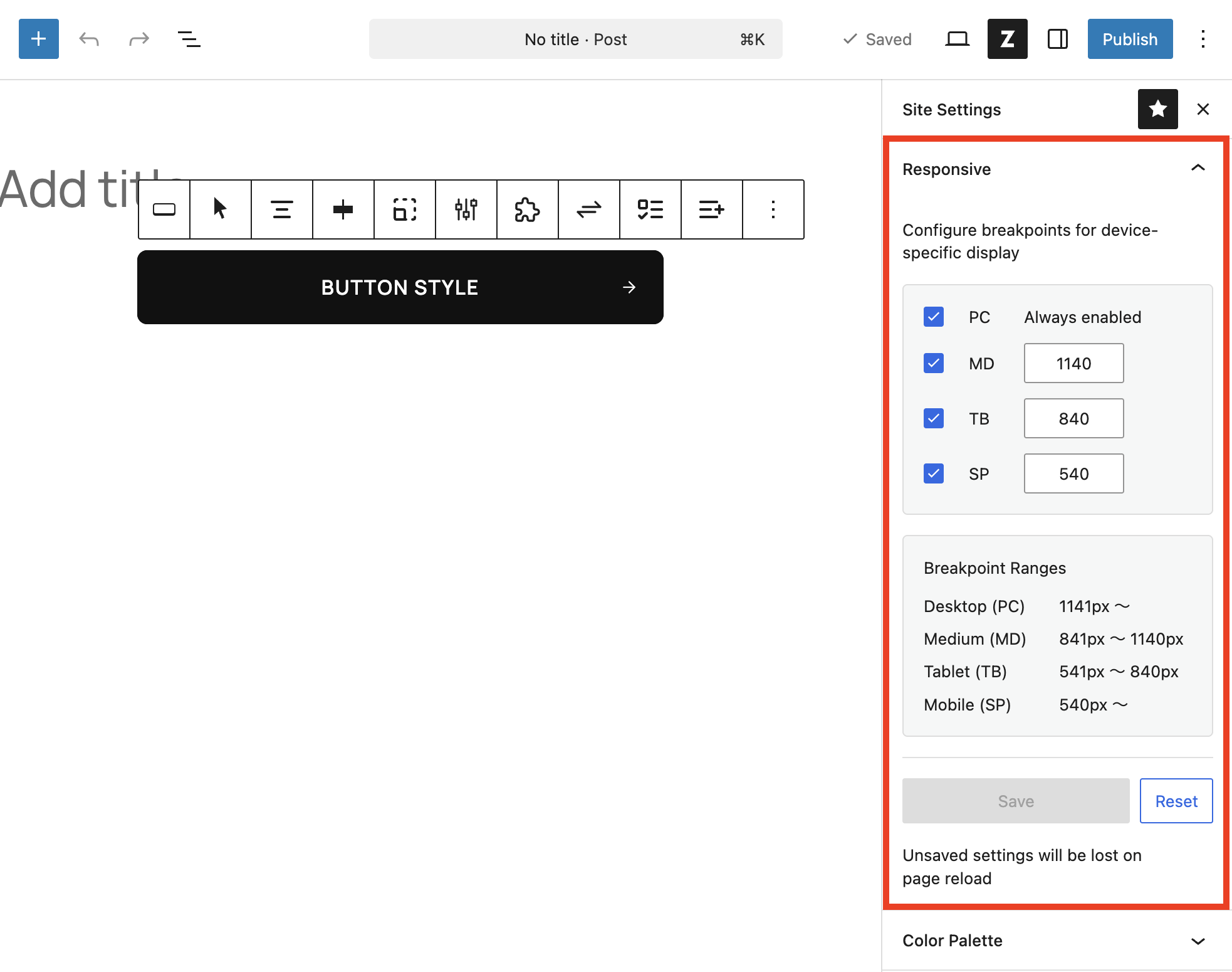
Setup Steps
- Enable the breakpoints you need among MD / TB / SP
- Enter the maximum width in px for each field
- Review the applied ranges in the Breakpoint Ranges section at the bottom
- Click Save
- When the save confirmation modal appears, make sure there are no unsaved edits, then click Reload
Verification Checklist
- Is PC always enabled and locked?
- Is the minimum value for MD kept higher than TB?
- Is the maximum value for TB lower than MD and higher than SP?
- Have you completed a page reload after saving?
Important Notes
- Any unsaved edits before the reload will be lost, so save your block content first
- Values that break the width hierarchy may be accepted during input but corrected to defaults on save
- Breakpoints are a site-wide setting — they cannot be customized per page
When to Revisit These Settings
Layout breaks at tablet width only
- Check whether the TB maximum width matches your actual design target
- If needed, review the enabled state of MD / TB / SP and adjust accordingly
Changes in the editor are not reflected
- This is usually because the page was not reloaded after saving
- If there are other unsaved edits, save those first, then reload